


Different designers include different things, and the industry does not have standardized terminology. "Brand identity" can mean a logo and a one-page PDF, or it can mean a full system with forty pages of guidelines. Here is what a complete engagement should cover.
The logo system
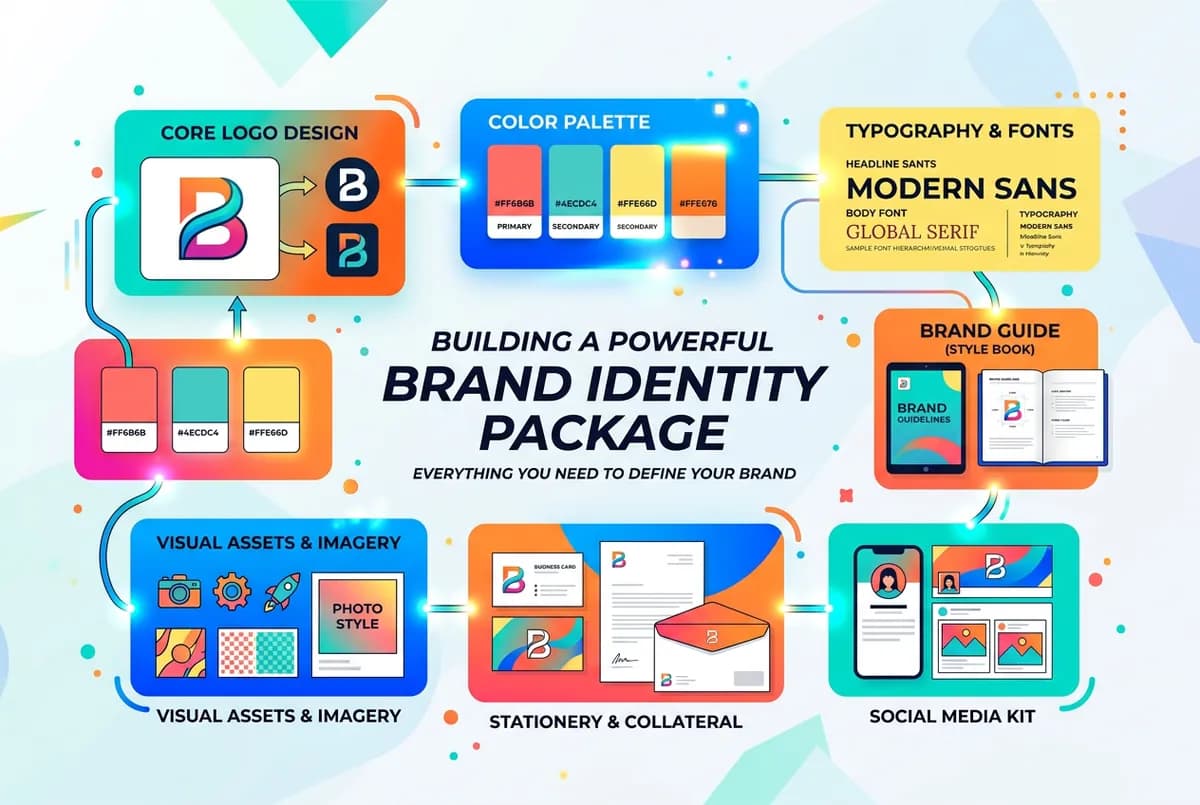
Most identity packages include multiple versions of the logo. The primary logo is the full version — wordmark with symbol, or full wordmark — that goes on most applications. The secondary or lockup version is usually stacked or simplified for horizontal and vertical constraints. The icon or favicon version is a stripped-down mark for small applications: app icons, social profile images, favicons, embossed finishes.
You should receive all of these in vector format (AI or SVG) so they can be scaled without quality loss, and in PNG format for web use with transparent backgrounds.
Color palette
A defined palette includes primary colors (two to three that carry the brand), secondary or accent colors used more sparingly, and neutral colors for backgrounds and body text. Each color should have values in hex, RGB, CMYK, and Pantone. Without Pantone values, you will have a hard time getting consistent color from printers and manufacturers.
Typography
At minimum: a heading typeface and a body typeface, with specifications for sizes, weights, and line spacing. Some packages include a modular scale, rules for when each typeface is used, and a web-safe fallback. If the fonts are licensed, clarify whether the license transfers to you or whether you need to purchase it separately.
Brand guidelines document
This is the document that explains how to use everything else. Good guidelines answer the questions that come up when someone who is not the designer needs to produce brand materials: logo usage rules, color palette with usage context, typography rules, image direction, correct usage examples, and things to avoid.
Length is not the point. Usability is. A ten-page document that a developer or social media manager can follow is worth more than a sixty-page document no one opens.
What is often left out
Pattern or texture elements are commonly omitted from base packages but used in brand fills and collateral. Photography art direction — a brief description of the style and mood that fits the brand — is often missing too. Without it, every photo on your channels is chosen by whoever is managing content that week, and visual consistency falls apart quietly.
What to ask before starting
Can I see a sample brand guidelines document from a previous project? This is the best way to evaluate what you will actually receive. Who owns the source files at the end — they should come to you on final payment. Are fonts licensed for commercial use? You need commercial licenses, not personal-use ones.
The deliverables list matters less than whether the designer can explain what each piece is for and how you will use it. That explanation tells you more about the quality of the work than the list itself.
