


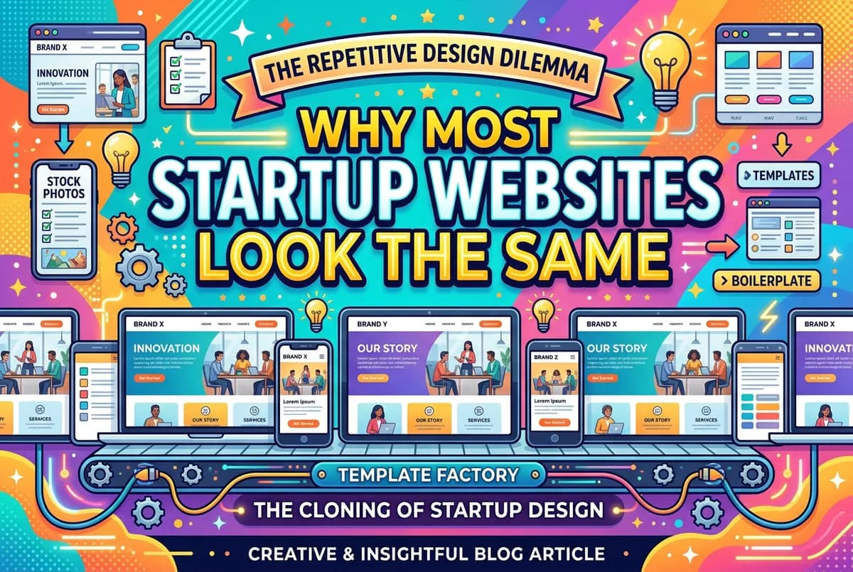
I can describe your startup's homepage without seeing it. Hero with a bold headline. A row of logo badges from press mentions or clients. A three-column features section. Testimonials. A CTA at the bottom.
If I am wrong, you are in the minority.
Where it comes from
The most common path to a startup website goes like this: the founder looks at competitors. The competitors look like each other. The founder says "make it like this but better." The designer either pushes back or does not. The site launches looking like a slightly improved version of everyone else in the space.
The other path: the founder picks a premium template, fills in the content, ships it. The template was designed to look professional for any SaaS or service business, which means it looks like every other SaaS or service business. Templates are fine. The problem is not customizing them past their defaults.
Why it costs you
Visitors make site judgments in under a second. If your site looks like your competitor's site, the visitor has no reason to stay with you specifically. In a crowded space, looking like everyone else is a positioning failure. Your visual identity is telling potential customers: we are roughly similar to the alternatives. That is not a great sales message.
The specific things that make startup sites identical
The gradient background. Gradient plus dark background plus light text was a strong aesthetic for 2018 to 2021. In 2025, it reads as a starter template.
The stock photo team section. A grid of placeholder headshots for "our team" on a site that is actually two people does not help credibility.
The generic headline. "Transform your [noun] with AI" or "The [noun] platform for [adjective] teams." These are fill-in-the-blank formulas that work for any company, which means they work for none of them.
The social proof row with no context. "Trusted by 10,000 companies" with a row of logos is easy to produce and easy to ignore. A specific quote from a specific person about a specific outcome is harder to produce and much harder to dismiss.
What to do differently
Lead with the specific problem. Not your product category — the actual problem your customer has. Something specific enough that it excludes most visitors and speaks directly to the ones it is for.
Use real photos. Your actual office, your actual team, your actual product in use. Nothing distinguishes a site faster from the template aesthetic.
Write for one person. Most startup homepages are written as if the audience is a demographic. The best ones read as if the writer knew exactly who they were talking to.
Pick one visual distinction and commit to it. A distinctive type choice, an unusual color, a consistent illustration style. One thing, applied consistently, is enough to make your site feel like it belongs to someone specific.
Looking different from your competitors is not a vanity project. It is the first impression you make on every visitor who has already seen your competitors' sites. They will notice if you look the same.
